1. Font
Choosing the right font is a seemingly easy process until you’ve tried it. There are so many industries that one company may belong. Your logo can tell the audience what industry you are from merely by the use of your type. Typographic logo or not, if your logo use type on some parts of it, it can still play a huge role for the entire effect of the logo. It would be a lot different if the logo is for a design or arts company and for that of a film company. See to it that you know when to use sans serif, decorative fonts and cursive fonts. Let your type tell the audience what the company or website is.
2.Color
When designing an awesome logo for your business, it’s important to take into account the way people interpret color. It’s the right time to ask, what kind of emotion do I want my brand to convey? Color offers an instantaneous method for conveying meaning and message in your logo designs. It’s probably the most powerful non-verbal form of communication we can use. Our minds are programmed to respond to color. The subtle messages we get from color shape our thoughts.
3.White space
Negative Space is also called white space. These are spaces without content although they are called white space, “Negative Space” doesn’t have to be white. It can be any color, it just doesn’t have any content. Negative space is also a design factor although it is not easily recognizable, basically the use of negative space is to add symmetry to your layout and make it look clean, natural for visitors.
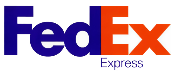
See the negative space between the E and x that looks like an arrow ?
